

The Method
The System Behind the Work
FoldedLogic is not a visual layer added at the end of a project. It is a working method for shaping pages from the inside out, so content structure, responsive behavior, visual hierarchy, and front-end implementation stay aligned throughout the build.
The goal is not to make every project look the same. The goal is to give each project a stronger underlying system, so the final website feels intentional, performs well, and remains easier to understand after launch.
Pages are divided into meaningful sections before visual details accumulate, giving each part of the layout a clear purpose and relationship to the rest of the page.
Elements are assigned a job before they are styled. Some lead, some support, some frame the content, and some intentionally stay quiet.
Spacing is treated as part of the system. Margins, gaps, rhythm, and density help create hierarchy instead of being patched in as visual filler.
Desktop, tablet, and mobile behavior are considered from the beginning, so the layout adapts with intention instead of being repaired breakpoint by breakpoint.
CSS naming, layout utilities, reusable patterns, and front-end decisions are organized to keep the build understandable, efficient, and easier to maintain.
The architecture has been shaped through repeated use on real projects, improving consistency, speed, responsiveness, and long-term maintainability over time.
FoldedLogic is a performance-minded CSS layout architecture for building pages through clear structure, repeatable patterns, and intentional visual hierarchy. Inspired by origami and spatial composition, it treats layout, responsiveness, layering, and implementation as one connected system rather than separate stages.
It is a deliberate process for building pages that feel resolved in both presentation and implementation.

Layout System
Pages Built from Organized Parts
FoldedLogic treats a website page as a system of sections, pockets, columns, panels, content groups, and visual relationships. Instead of relying on one-off styling for every block, the layout is built from reusable patterns that can be adjusted without losing control of the whole page.

Large page areas define major content shifts, visual rhythm, and the relationship between one message and the next.

Consistent inner widths and spacing rules keep content controlled across large screens, standard desktops, tablets, and mobile devices.

Flexible column patterns support balanced compositions, service grids, text-and-image pairings, feature blocks, and responsive content stacking.

Reusable panels provide structure for repeated content types without forcing every page element into the same visual treatment.

Small layout helpers manage alignment, spacing, stacking, width behavior, and responsive adjustments without excessive custom CSS.

Shared values for type, spacing, color, gaps, borders, and motion make the interface more consistent and easier to refine.
CSS Architecture
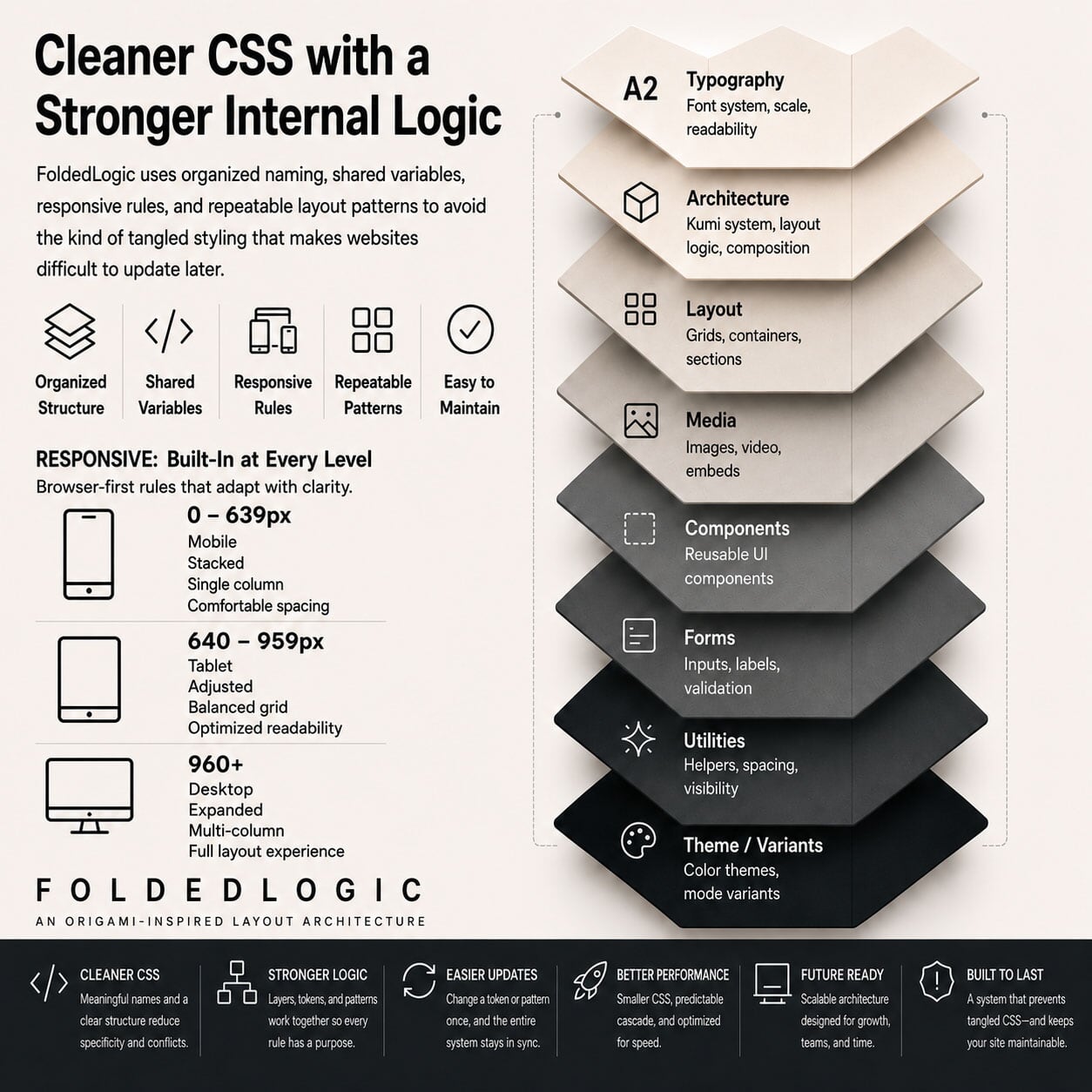
Cleaner CSS with a Stronger Internal Logic
The CSS behind a site matters. FoldedLogic uses organized naming, shared variables, responsive rules, and repeatable layout patterns to avoid the kind of tangled styling that makes websites difficult to update later.
Instead of treating CSS as a pile of page-specific exceptions, FoldedLogic uses a deliberate structure. Typography scales, line heights, column gaps, button behavior, image framing, panel spacing, and mobile changes are handled through a controlled system. That makes the site easier to extend and easier to debug.
This approach is especially useful for custom-coded sites, rebuilds, landing pages, designer handoffs, and projects moving away from bloated builder output. The front end remains flexible, but the flexibility comes from structure rather than from unchecked overrides.
Responsive Behavior
Responsive Layouts That Are Planned, Not Patched
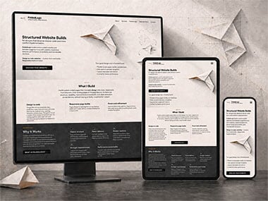
Responsive design is not only about making a page fit on smaller screens. It is about preserving hierarchy, readability, spacing, and intent as the available space changes.
FoldedLogic considers mobile and tablet behavior while the layout is being formed. Columns, image crops, content order, navigation behavior, touch targets, font sizes, line heights, and section spacing are planned as part of the same system.
The result is a page that adapts more naturally. Important content remains prominent, supporting content does not overwhelm the screen, and the layout does not depend on a long chain of emergency breakpoints to stay usable.
Performance and Maintainability
Built to Stay Lean After Launch
A website should not become fragile the moment it needs a new section, image, service page, or content update. FoldedLogic favors lean implementation, clean structure, and front-end decisions that support long-term use.
Performance-minded code
Layouts are built with attention to page weight, asset loading, image behavior, CSS efficiency, and the front-end decisions that affect real-world speed.
Accessible structure
Heading order, semantic markup, readable content flow, navigation behavior, and screen-size changes are considered as part of the build.
Clean markup, logical page structure, strong internal hierarchy, metadata awareness, and crawlable content help support search visibility from the front end.
Maintainable implementation
Reusable classes, predictable spacing, organized CSS, and fewer one-off fixes make future edits less risky and easier to understand.
Where It Helps
Best for Projects That Need More Than a Template
FoldedLogic architecture is most useful when the project needs design control, clean implementation, responsive precision, and a site structure that can hold up beyond the first launch.
Designer handoffs
For finished designs and visual layouts that need to become responsive, production-ready pages without losing spacing, proportion, or design intent.
Builder replacements
For websites that have become slow, difficult to edit, visually inconsistent, or too dependent on bulky visual-builder systems.
Agency support
For overflow work, landing pages, rebuilds, and front-end production support that needs to be organized and easy to hand off.
Content-heavy sites
For organizations that need clear page structure, readable content presentation, accessible markup, and long-term maintainability.
Custom-coded builds
For projects where performance, structure, and implementation quality matter more than the convenience of a prebuilt theme.
Technical rebuilds
For existing websites that need cleaner code, better responsive behavior, stronger hierarchy, and a more dependable front-end foundation.
Architecture in Practice
A Method Built Through Real Website Systems
FoldedLogic is shaped by years of work on websites where structure had to support more than layout alone. Page architecture, reusable systems, technical SEO, metadata, schema, accessibility, performance, and maintainability all had to work together inside real builds, migrations, redesigns, and content-heavy sites.
Across this work, website architecture has meant more than arranging page sections. It has included implementing structured data, schema, metadata, and indexing controls across hundreds of site sections. Spending 2,500+ hours designing reusable website architecture systems. Working on 80+ projects involving custom page architecture beyond standard brochure-site layouts. And supporting 100+ projects where performance, accessibility, technical SEO, and front-end implementation all had to work together.
That practical background is what makes the architecture useful. It is not theory layered onto a website after the fact, but is a way of building pages so content, code, and technical requirements have a clearer place from the beginning.
The Result
A Website That Feels Designed and Built With the Same Logic
Good front-end architecture is not always obvious at first glance, but it shapes how the entire site behaves. It affects how quickly pages load, how easily content can be scanned, how well layouts respond, how cleanly future sections can be added, and how confidently the site can be maintained.
FoldedLogic brings those decisions into the build from the beginning, creating websites that are structured, responsive, performance-minded, and easier to work with after launch.